How to Build an Email List From Your Website
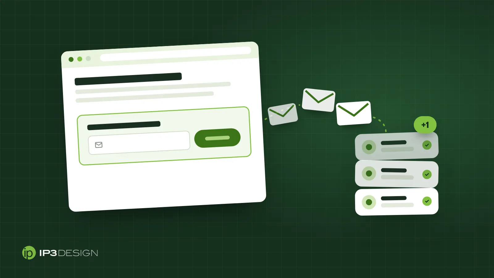
Most people who visit your website will leave without calling, booking or buying. That’s normal. They were comparing options, checking your hours, or just not ready yet. The problem is that once they close the tab, you have no way to reach them again unless they come back on their own.
An email list fixes that. Every person who gives you their address is someone you can remind, follow up with and invite back, without paying for another click. For a small business, it’s one of the few marketing channels you fully own. Google can change its rankings and social platforms can change who sees your posts, but your list stays yours.
The good news is that your website is already the best place to build one. You don’t need a big budget or a clever growth hack. You need a few well-placed forms, a reason for people to sign up, and an honest plan for what you’ll send them. Here’s how we’d set it up.
Why your website is the right place to start
People on your website have already shown interest. They searched for something you offer, clicked an ad, or followed a link from a friend. That makes them far more likely to want your emails than a random list of addresses ever would be.
It also works around the clock. A paper sheet by the register only catches people when someone remembers to ask; your website asks every visitor, every day.
One thing we’d steer you away from right at the start: buying or renting a list. It’s tempting when your own list is small, but those people never asked to hear from you. They ignore your emails, mark them as spam, and drag down your sender reputation, which hurts delivery to the subscribers who did want to hear from you. We covered the deliverability side in detail in why your marketing emails go to spam. Short version: a small list of people who opted in beats a big list of strangers every time.
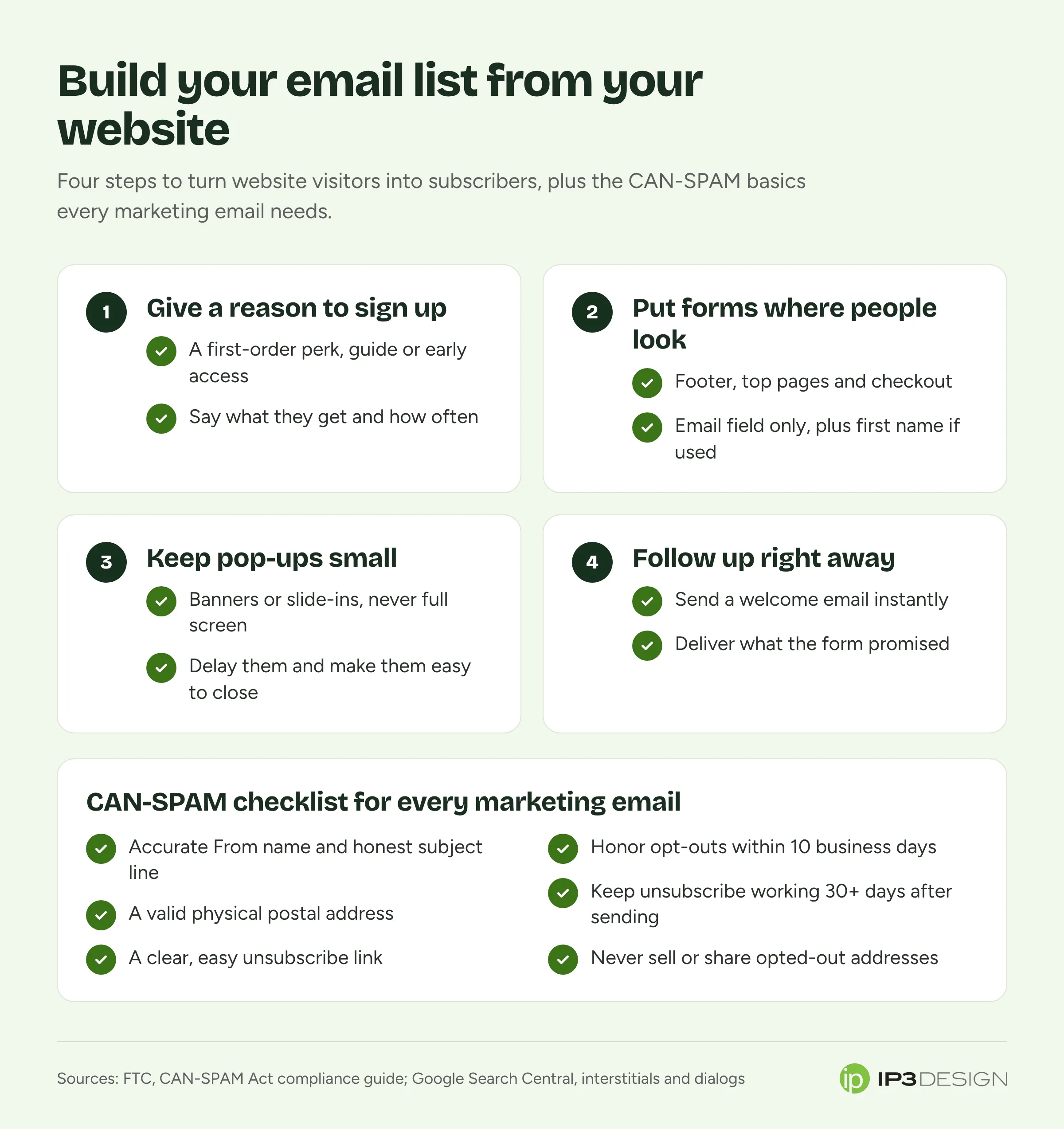
Give people a real reason to sign up
“Subscribe to our newsletter” is the weakest invitation you can write. Nobody wakes up wanting another newsletter. What they want is something useful, and your sign-up form should say exactly what that is.
The right offer depends on your business and what your customers care about. A few that tend to work for small and local businesses:
- A discount or perk on the first purchase. Common for retail shops, restaurants and online stores. Simple, clear and easy to deliver automatically.
- A practical guide or checklist. A Glendale lawn care company might offer a seasonal yard care calendar. A CPA firm might offer a tax deadline checklist. It works best when it answers a question people already ask you.
- Early access or first notice. New menu items, restocks, class openings, appointment slots for busy seasons. Good when your customers are already fans.
- Reminders they’d actually want. Service reminders, seasonal maintenance, “your favorite item is back” alerts.
- Useful updates, stated plainly. If you really do send one helpful email a month, say what’s in it: “One email a month with our best home maintenance tips. No spam.”
Whatever you offer, be specific about what people will receive and how often. “Get 10% off your first order, plus about two emails a month with new arrivals” sets an expectation you can meet. Vague promises lead to people signing up for one thing, getting another, and hitting the spam button.
Say you run a bakery in Burbank. “Join our list” will get a few sign-ups. “Get first notice when holiday pie orders open” will get a lot more in October, because it solves a real problem your customers have every year.
Put sign-up forms where visitors already look
You don’t need a form on every square inch of your site. You need forms in the places where interested people naturally end up. These are the spots we’d start with.
Your footer
A short sign-up form in the footer of every page is the baseline. It’s low effort, it doesn’t interrupt anyone, and it catches people who scrolled to the bottom looking for more. On its own it won’t bring in a flood of sign-ups, but it’s always there.
Inside your best content
If you have blog posts, guides or resource pages that get steady traffic, put a sign-up box inside them, ideally one that matches the topic. Someone reading your post about preparing a home for sale is a great candidate for a “home seller checklist” offer, and a much worse one for a generic newsletter.
Your homepage and key service pages
A clear, simple sign-up section partway down your homepage works well, especially if you have a strong offer. On service pages, be careful: the main goal there is usually a call, a booking or a quote request. A sign-up form can be a secondary option for people who aren’t ready yet, but it shouldn’t compete with your main call to action.
Checkout and account creation
For online stores, checkout is one of the best moments to ask. Add a clear, unchecked box that says what they’re agreeing to, such as “Email me about new products and sales.” We’d recommend leaving it unchecked so the people who tick it actually want your emails. A list built from pre-checked boxes tends to have more complaints and fewer opens.
Your contact and booking forms
Same idea: an optional checkbox for “Send me occasional tips and offers.” Never assume that someone who asked for a quote also agreed to a newsletter. Keep the two separate.
A dedicated landing page
A simple page built around one offer, with a short form, gives you a link you can share anywhere: social profiles, your Google Business Profile posts, printed receipts, a QR code at the counter.
Use pop-ups without annoying people or hurting SEO
Pop-ups get a bad reputation because so many sites use them badly. A full-screen box that appears the instant you land, before you’ve read a word, is frustrating. It’s also something Google specifically warns against.
Google’s guidance on interstitials and dialogs says intrusive pop-ups can frustrate visitors and erode their trust, and that they can make it hard for search engines to understand your content, which may lead to poor search performance. Google’s recommendation is to use banners that take up only a small part of the screen instead of covering the whole page, and it mentions newsletter sign-up prompts as one use for those smaller banners. It also advises against sending visitors to a separate page just to collect their input.
In practice, here’s how we’d handle it:
- Don’t cover the page. A slide-in box in the corner, or a slim bar at the top or bottom of the screen, gets noticed without blocking what people came to read.
- Wait a little. Show it after someone has scrolled through part of a page or spent some time on the site, not the moment they arrive.
- Make it easy to close. A visible close button, big enough to tap on a phone. If people have to hunt for the X, they’ll hunt for the back button instead.
- Don’t show it again and again. If someone closes it, leave them alone for a while. If they’ve already signed up, stop showing it entirely.
- Think mobile first. Something that looks small on a desktop monitor can fill most of a phone screen. Test it on your own phone before it goes live.
Most email platforms and website builders let you control timing, placement and how often a form shows. Use those settings. A polite pop-up with a good offer can be your strongest source of sign-ups; a rude one costs you visitors and possibly search traffic.
Keep the form short
Every extra field you add gives people a reason to quit. For most small businesses, an email address is enough to start. A first name is a reasonable second field if you’ll actually use it to personalize your emails.
Ask for more only when it changes what you send. A garden center might ask “Are you a home gardener or a professional?” because the two groups want different emails. A clinic or law firm generally shouldn’t ask for any sensitive details on a newsletter form at all. If you won’t use the answer, don’t ask the question.
Two more details that matter:
- Say what happens next. “Check your inbox for your discount code” is better than a vague “Thanks!” message.
- Make the button specific. “Send me the checklist” or “Get my 10% off” tells people what they’re getting. “Submit” doesn’t.
Confirm sign-ups and send a welcome email right away
The moment after someone signs up is when they’re most interested in you. Don’t waste it by going quiet until your next monthly newsletter.
Set up an automatic welcome email that goes out immediately. It should deliver whatever you promised (the code, the guide, the link), remind people what they signed up for and how often you’ll write, and give them one simple next step, like browsing a product category or booking a visit.
Many email platforms also offer double opt-in, where new subscribers get an email asking them to confirm before they’re added to your list. The trade-off is simple: some people never click the confirmation, so your list grows a bit slower. In return, you avoid typos, fake addresses and people signed up by someone else, and your list tends to be healthier. If you’re seeing a lot of junk sign-ups or bounced emails, double opt-in is usually worth turning on.
Follow the rules from the first email
In the US, marketing email is governed by the CAN-SPAM Act, and the FTC’s CAN-SPAM compliance guide for business lays out what it requires. A few points surprise people:
- It covers all commercial email. It isn’t only for bulk senders, and the FTC says there’s no exception for business-to-business email.
- Every marketing email needs a valid physical postal address. That can be your street address, a registered PO box, or a registered private mailbox.
- You need a clear way to unsubscribe. It has to be easy to spot and easy to use.
- Opt-outs must be honored within 10 business days. Your unsubscribe option also has to keep working for at least 30 days after you send the message.
- You can’t make unsubscribing a chore. No fees, no asking for personal information beyond an email address, and no steps beyond replying to an email or visiting a single page.
- You can’t sell or transfer the addresses of people who opted out.
- Your headers and subject lines must be honest. The “From” name should be accurate, and the subject should reflect what’s inside.
- Hiring someone doesn’t move the responsibility. If an agency or platform sends email for you, both of you can be held responsible.
The FTC guide lists penalties of up to $53,088 for each email that violates the law. That’s per email, so mistakes on a big send add up quickly.
CAN-SPAM doesn’t require you to get permission before sending marketing email, but the big inbox providers expect it, and your results will be much better if you only email people who asked. If you also collect phone numbers for texts, those rules are stricter and separate; our guide to SMS marketing rules covers them. This article is general information, not legal advice, so talk to a lawyer if you have specific questions about your situation.
A simple plan for this week
If your site has no sign-up form today, here’s how we’d get started:
- Pick one offer. Choose the single most useful thing you could give a new subscriber, and write one sentence describing it plus how often you’ll email.
- Set up your email platform. Create a list, a short form with just an email field (plus first name if you’ll use it), and an automatic welcome email.
- Add the form in two places. Your site footer and your most visited page are a good start.
- Add a polite slide-in or banner. Delay it, make it easy to close, and test it on your phone.
- Check your compliance basics. Physical address in the footer of your emails, a working unsubscribe link, and accurate sender details.
- Look at the numbers in a month. How many people signed up, from which form, and how many opened the welcome email. Keep what works and change what doesn’t.
Frequently asked questions
How many subscribers do I need before I start emailing?
None in particular. Start sending as soon as you have a welcome email set up and a few people on your list. A small list of engaged people is valuable, and building the habit early matters more than the size.
Are pop-ups bad for SEO?
Not all of them. Google warns against intrusive interstitials that cover the content, and recommends small banners instead. A slide-in or bar that leaves your content readable is a much safer choice than a full-screen pop-up on arrival.
Can I add my customers to my email list?
CAN-SPAM doesn’t require prior consent, but we’d still recommend asking. Customers who never agreed to marketing emails are more likely to mark them as spam, which hurts your delivery to everyone else. An optional checkbox at checkout or booking is the cleaner route.
Should I use single or double opt-in?
Single opt-in grows your list faster. Double opt-in keeps it cleaner by confirming every address. If you’re seeing fake sign-ups, typos or lots of bounces, switch to double opt-in.
What should my first email say?
Deliver what you promised, remind people what they’ll get and how often, and offer one clear next step. Keep it short and send it right away.
Get help building a list that turns into customers
A good email list starts with a website that’s built to collect it: forms in the right places, pop-ups that don’t drive people away, and a welcome series that gets the relationship off to a good start. IP3 Design handles both sides, from website design that makes signing up easy to email and SMS marketing that keeps your list engaged and your sends compliant.
If you’d like a second set of eyes on how your site collects email today, or help setting it up from scratch, get in touch with our team.