Website Accessibility for Small Businesses: What WCAG and the ADA Mean for You
Maybe a customer emailed to say they couldn’t finish your booking form. Maybe you read about a lawsuit over a restaurant website and wondered if yours would hold up. Or maybe someone said “WCAG” in a meeting and you nodded along.
However you got here, the questions are usually the same. Does the law say my website has to be accessible? What standard am I supposed to meet? And what do I actually fix first?
This guide covers what the Americans with Disabilities Act (ADA) and the Web Content Accessibility Guidelines (WCAG) say, in plain English, and gives you a plan you can start on this week. One caveat up front: we’re web designers, not lawyers. If you’ve received a demand letter or a complaint, talk to an attorney before you do anything else.
What “website accessibility” means
An accessible website is one that people with disabilities can use to get the same information and do the same things as everyone else. That includes people who are blind and use a screen reader to hear the page read aloud, people with low vision who zoom in or need strong contrast, people who are deaf or hard of hearing and rely on captions, and people who can’t use a mouse and get around with a keyboard or other device.
For a small business, “the same things” means the stuff that matters: reading your hours, seeing your menu or services, booking an appointment, filling out a quote request, paying an invoice, buying a product.
Say you run a dental practice in Glendale. A patient who uses a screen reader lands on your site to book a cleaning. If your booking button is an image with no text, their screen reader may just announce “button” or a file name. If your form fields have no labels, they hear “edit text, edit text, edit text” with no idea which box is for their phone number. They give up and call someone else, and you never find out.
What the ADA says about websites
The ADA applies to state and local governments under Title II and to businesses open to the public under Title III. Title III covers what the law calls public accommodations, which includes retail stores, banks, hotels, medical offices, restaurants and bars, theaters and many other everyday businesses.
The Department of Justice has published guidance on web accessibility and the ADA that spells out its position. The key points for a business owner:
- Title III requires businesses open to the public to provide people with disabilities “full and equal enjoyment” of their goods and services.
- The Department says it “has consistently taken the position” that the ADA’s requirements apply to everything a public accommodation offers, “including those offered on the web.”
- There is no Department of Justice regulation that sets detailed technical standards for business websites. Businesses “have flexibility in how they comply.”
- Existing technical standards, specifically WCAG and the federal Section 508 Standards, “provide helpful guidance” on how to make a site accessible.
So the Department of Justice says the ADA applies to the services you offer online, even without a specific rulebook for private businesses. The flexibility is in how you get there, not whether you need to.
What about the 2024 rule you may have heard about?
In 2024 the Department of Justice finalized a rule for state and local governments under Title II. That rule adopted WCAG 2.1 Level AA as the technical standard for government websites and mobile apps.
In April 2026 the Department published an interim final rule that pushed the compliance dates back. Governments serving 50,000 or more people now have until April 26, 2027. Smaller governments and special district governments have until April 26, 2028.
The interim rule says plainly that the Title III regulations for private businesses “are not addressed in this rulemaking.” So that rule doesn’t apply to your business directly. We still think it’s useful as a signal: when the federal government did choose a technical standard for websites, it picked WCAG 2.1 Level AA. If you’re looking for a sensible target, that’s a reasonable one, and WCAG 2.2 Level AA is even better. More on that below.
WCAG in plain English
WCAG is published by the World Wide Web Consortium (W3C), the group that develops many of the standards the web runs on. It’s the standard the Department of Justice points to in its guidance, and the one it chose for the government rule above.
There are three versions you’ll see mentioned:
- WCAG 2.0, published in December 2008
- WCAG 2.1, published in June 2018
- WCAG 2.2, published in October 2023
They’re designed to be backwards compatible. The W3C says content that conforms to WCAG 2.2 also conforms to 2.1 and 2.0, with one small technical exception, and it encourages people to use the latest version. In practice, aiming for 2.2 covers you for the older versions too.
Each version has success criteria at three levels: A, AA and AAA. Level A is the bare minimum. Level AA is the middle ground, and it’s the level the 2024 government rule requires. Level AAA is the strictest and isn’t realistic for every page of most sites.
The guidelines are grouped under four principles. Your content should be perceivable (people can see or hear it in some form), operable (people can use it with whatever input they have), understandable (it reads clearly and behaves predictably), and it should work reliably with the browsers and assistive technology people use today and in the future.
The W3C’s WCAG 2 at a Glance page boils the whole standard down to a one-page list. It’s the best place to start if you want to understand the guidelines without reading the full technical spec. A few of the items on it:
- Provide text alternatives for non-text content.
- Provide captions and other alternatives for multimedia.
- Make all functionality available from a keyboard.
- Give users enough time to read and use content.
- Help users avoid and correct mistakes.
The six barriers we see most
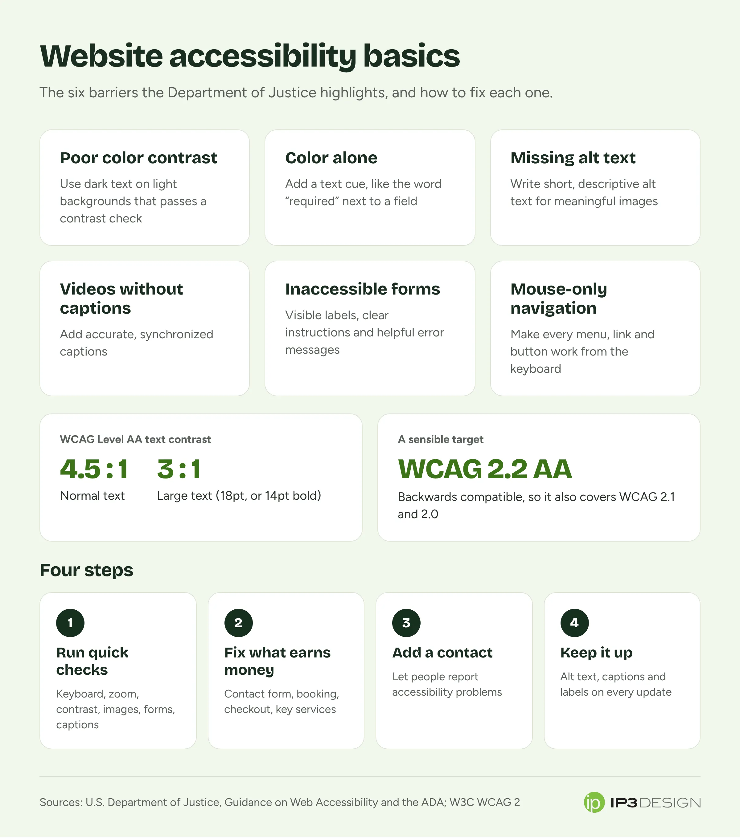
The Department of Justice guidance lists six common barriers that keep people with disabilities from using websites. They line up closely with what we find when we review small business sites, so they’re a good place to focus.
1. Poor color contrast
Light gray text on a white background looks sleek in a design mockup and is hard for many people to read. WCAG Level AA asks for a contrast ratio of at least 4.5:1 between normal text and its background, and at least 3:1 for large text. WCAG defines large text as at least 18 point, or 14 point if it’s bold. Text that’s part of a logo or brand name has no contrast requirement.
Free contrast checkers will tell you whether two colors pass.
2. Using color alone to convey meaning
A form that marks required fields only in red, or a chart where the only difference between two lines is green versus orange, leaves out anyone who can’t tell those colors apart. The fix is simple: add a text cue. Put the word “required” next to the field. Label the lines on the chart.
3. Images without text alternatives
Alt text is a short written description attached to an image. Screen readers read it aloud. Photos, illustrations, charts and image-based buttons all need it if they carry meaning. A photo of your storefront might get “Front entrance of our Brand Boulevard shop.” A purely decorative swirl can be marked as decorative so screen readers skip it.
Useless alt text, like “IMG_4417.jpg” or “image,” is nearly as bad as none. Automated tools can tell you when alt text is missing. Only a person can tell you whether it’s any good.
4. Videos without captions
If you have a welcome video, product demo or testimonial video on your site, it needs accurate captions that are in sync with the audio. The Department of Justice guidance also mentions identifying who’s speaking. Auto-generated captions are a starting point, but read through them: they often get names, products and industry terms wrong.
5. Inaccessible forms
Forms are where accessibility problems cost you the most, because a form is usually how someone becomes a customer. An accessible form has:
- A visible label for every field that a screen reader can announce
- Clear instructions, such as the date format you expect
- Error messages that say what went wrong and how to fix it
- The ability to fill out and submit the whole form with a keyboard
Placeholder text inside the box (“Your email”) isn’t a label. It disappears once someone starts typing.
6. Mouse-only navigation
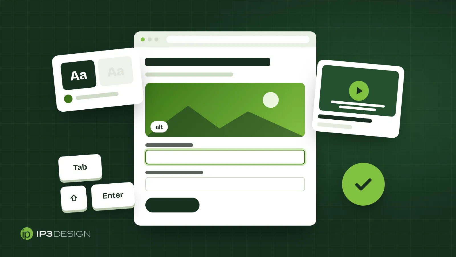
Some people can’t use a mouse at all. They move through a page with the Tab key and press Enter to follow links and buttons. If your menu only opens on hover, or your “Book now” button only responds to a click, they’re stuck. Every link, button, menu and form control should work from the keyboard, and there should be a visible outline showing where you are on the page.
How to check your own site in an afternoon
You don’t need special software to find the biggest problems. The W3C publishes a set of “Easy Checks” meant to help anyone start assessing a page, covering things like page titles, alt text, headings, color contrast, resizing text, keyboard access, forms and captions. Here’s a version you can run yourself on your homepage, your main service page and your contact or booking page.
- Unplug your mouse. Use only the Tab, Shift+Tab and Enter keys. Can you reach every menu item, button and form field? Can you always see where you are? Can you submit your contact form?
- Zoom in. Use your browser’s zoom to make the page much larger. Does the text get bigger without overlapping or getting cut off? Can you still reach the menu?
- Squint at your colors. Look for pale text, text over busy photos and buttons that blend into the background. Run anything questionable through a contrast checker.
- Look at your headings. Does each page have one main heading, with sections under it in a logical order? Headings that are just bold text instead of real headings in the page structure are harder for screen reader users to skim.
- Check your images. Most browsers and free extensions can show you each image’s alt text. Make sure the important ones describe what they show or what they do.
- Submit your form wrong on purpose. Leave a required field empty. Is the error message clear, and does it say which field needs fixing?
- Play your videos with the sound off. Are there captions, and are they accurate?
The W3C is clear that a page can seem to pass quick checks and still have significant barriers, and that a fuller evaluation is needed for a complete picture. This afternoon exercise is about finding the obvious problems, not proving your site is compliant.
A practical plan for the next few weeks
Here’s the order we’d tackle things in for a typical small business site.
This week: run the checks above on your three or four most important pages. Write down every problem you find. Don’t try to fix the whole site at once.
Next, fix the pages that make you money. Your contact form, booking flow, checkout and main service pages come first. A barrier on your “About our history” page is worth fixing. A barrier on your quote form is costing you customers today.
Add a way for people to report problems. The Department of Justice guidance specifically lists giving the public a way to report accessibility issues. A short accessibility statement with an email address and phone number is enough to start. Answer those messages quickly and treat them as free testing.
Fix it at the template level. Most contrast, heading, menu and form problems live in your site’s design and templates, not on individual pages. Fixing the template fixes every page that uses it. This is also why accessibility is much cheaper to build in during a redesign than to patch afterward. If your site has other problems too, our post on signs your website needs a redesign can help you decide which way to go.
Make it part of every update. New blog posts need alt text, new videos need captions and new forms need labels. Put those on the checklist for whoever updates your site.
What about accessibility plugins and overlays?
You’ve probably seen ads for a widget that promises instant compliance with one line of code. We’d be careful. The six barriers above live in your colors, images, videos, forms and code, and a toolbar sitting on top doesn’t caption your videos or properly label your form fields. Spend that money fixing the real issues.
Automated scanners are more useful. They quickly catch missing alt text, missing labels and contrast failures across many pages. They can’t judge whether alt text makes sense or an error message is clear, so treat them as a first pass.
Frequently asked questions
Does the ADA apply to my small business website?
If your business is open to the public, the Department of Justice’s position is that the ADA’s requirements apply to the goods and services you offer, including on the web. There’s no specific technical regulation for private business websites, so you have flexibility in how you make your site accessible. For questions about your specific situation, talk to an attorney.
Which version of WCAG should I aim for?
We recommend WCAG 2.2 Level AA. The W3C encourages using the latest version, and because the versions are backwards compatible, meeting 2.2 also covers 2.1 and 2.0. WCAG 2.1 Level AA is the standard the Department of Justice chose for state and local government sites, so it’s a reasonable minimum.
How often should I check accessibility?
Check your key pages whenever you add new features, forms or design changes, and run a full review at least once a year. If someone reports a problem, fix it and check whether the same issue appears elsewhere on the site.
How we can help
Accessibility is built into how we approach website design at IP3 Design. We think about contrast, headings, keyboard access and form labels from the first layout, because it’s far easier to get them right at the start than to fix them later. It also tends to go hand in hand with a faster, cleaner site, which we wrote about in our guide to Core Web Vitals.
If you’d like a second set of eyes on your current site, or you’re planning a new one and want accessibility handled from day one, get in touch with our Glendale team. We’ll look at the pages that matter most to your business and tell you plainly what we’d fix first.